
はじめに
インストール
matplotlibは標準パッケージではありません。インストールが必要です。
pip install matplotlib
インポート
インポートは公式サイトに従って、別名にしています。皆さんもこれを踏襲しているようです。
import matplotlib.pyplot as plt
データのサンプル
なんでもいいのですが、以下のようなデータを用意しました。なおVXXのデータにVIXYの終値と、VXXとVIXYの差になります。
| date | open | high | low | close | VIXY | diff | |
|---|---|---|---|---|---|---|---|
| 0 | 2018-01-18 | 27.415 | 28.520 | 26.525 | 26.950 | 22.345 | 4.605 |
| 1 | 2018-01-19 | 26.835 | 27.395 | 26.750 | 26.825 | 22.245 | 4.580 |
| 2 | 2018-01-22 | 27.030 | 27.050 | 26.055 | 26.255 | 21.755 | 4.500 |
| 3 | 2018-01-23 | 26.550 | 26.990 | 26.345 | 26.735 | 22.165 | 4.570 |
| 4 | 2018-01-24 | 26.845 | 28.120 | 26.825 | 27.385 | 22.705 | 4.680 |
基本
import matplotlib.pyplot as plt

fig = plt.figure(figsize=(12, 6))

ax = fig.add_subplot(1, 1, 1)

ax.set_title('title')
ax.set_xlabel('x')
ax.set_ylabel('y')

fig.show()
fig = plt.figure(パラメーター)
- 出力する画像の全体を作成します。
- パラメーターで各種設定を行います。パラメーターはいろいろありますが、サイズ以外はあまり使わないかもしれません。
figsize:画像のサイズをタプル型で(幅, 高さ)をインチで設定します。- その他は以下を参照してください。matplotlib.figure.Figure — Matplotlib 3.10.3 documentationmatplotlib.org

ax = fig.add_subplot(1, 1, 1)*本ページの最後のほうで例を紹介しています。
- 画像の中に、いくつのグラフを作成するか、どの位置かを設定します。
(縦, 横, 番号)- 縦、横:それぞれの個数を指定します。
- 番号:何番目の場所かを指定します。
ax.set_title('title')
- グラフのタイトルを設定します。
ax.set_xlabel('x')
- 横軸のタイトルを設定します。
ax.set_ylabel('y')
- 縦軸のタイトルを設定します。
fig.show()
- グラフの画像を表示します。
折れ線グラフ(plot)の作成
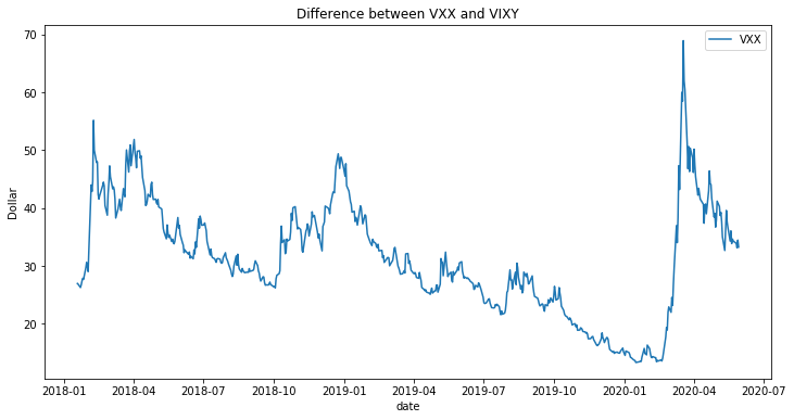
import matplotlib.pyplot as plt

# Set data
x = df["date"]
y = df["close"]

fig = plt.figure(figsize=(12, 6))

ax = fig.add_subplot(1, 1, 1)

ax.plot(x, y, label='VXX')

ax.legend()
ax.set_title('Difference between VXX and VIXY')
ax.set_xlabel("date")
ax.set_ylabel("Dollar")

fig.show()
折れ線グラフを設定
ax.plot(x, y, color='blue', label='VXX')
(x,y):横と縦の値を設定します。label:ラベルを設定します。color:ラインの色を指定できます。”blue”,”green”,”red”,”black”などmarker:マーカーのデザインを変更できます。markersize:マーカーの大きさを変更できます。linestyle:ラインの種類を変更することができます。”dashed”など詳しくはこちらlinewidth:ライン幅を指定できます。- 複数のラインを描画させる場合は、以下のように、もう一度追記すればいいだけです。
ax.plot(x, y, label='VXX')
ax.plot(x, df.VIXY, label='VIXY')
凡例(ラベル)を表示
ax.legend()
loc:凡例(ラベル)の表示位置を指定します。文字で指定 数値で指定 ‘best’ 0 ‘upper right’ 1 ‘upper left’ 2 ‘lower left’ 3 ‘lower right’ 4 ‘right’ 5 ‘center left’ 6 ‘center right’ 7 ‘lower center’ 8 ‘upper center’ 9 ‘center’ 10 bbox_to_anchor(x, y, width, height):凡例(ラベル)の表示位置を相対的に数値で指定します。
詳しくは以下を参照してください。matplotlib.legend — Matplotlib 3.10.3 documentationmatplotlib.org

散布図(scatter)の作成
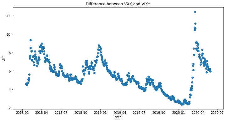
import matplotlib.pyplot as plt

# Set data
x = df["date"]
y = df["diff"]

fig = plt.figure(figsize=(12, 6))

ax = fig.add_subplot(1, 1, 1)

ax.scatter(x,y)

ax.set_title('Difference between VXX and VIXY')
ax.set_xlabel('date')
ax.set_ylabel('diff')

fig.show()
散布図を作成
ax.scatter(x,y)
(x,y):横と縦の値を設定します。c:色を指定することができます。marker:マーカーのデザインを変更できます。デフォルトは'o'となっています。alpha:色の濃さを調整できます。値は0〜1です。linewidth:マーカーの端のライン幅を指定できます。デフォルトは1.5です。edgecolors:マーカーの端のラインの色を指定できます。
その他は以下を参照してください。matplotlib.axes.Axes.scatter — Matplotlib 3.10.3 documentationmatplotlib.org

横や縦のラインを追加で作成
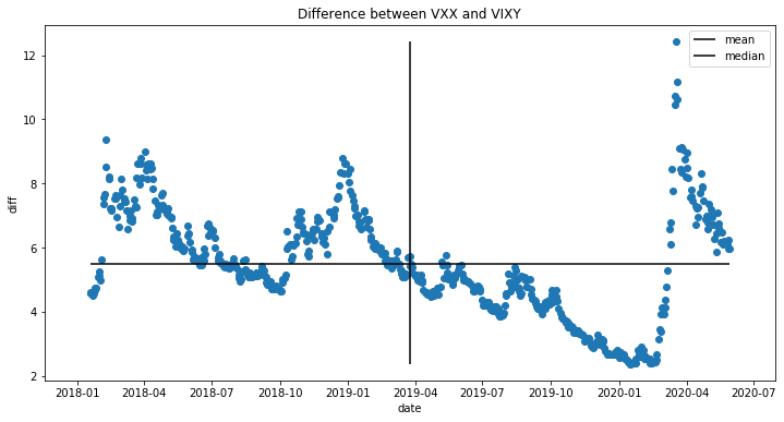
ax.hlines(y=df['diff'].mean(),xmin=df["date"].min(),xmax=df["date"].max(), label='mean') #横軸
ax.vlines(x=df['date'].mean(),ymin=df["diff"].min(),ymax=df["diff"].max(), label='median') #縦軸
横線を引く
ax.hlines()
- y:線を引く縦軸の値を設定します。
- xmin:線を引く横軸の最小値を設定します。
- xmax:線を引く横軸の最大値を設定します。
- label:任意でラベルを設定します。
縦を引く
ax.vlines()
- x:線を引く横軸の値を設定します。
- ymin:線を引く縦軸の最小値を設定します。
- ymax:線を引く縦軸の最大値を設定します。
- label:任意でラベルを設定します。
2画面のグラフを作成
一つの画像に2つのグラフやチャートを作成することができます。
本ページの最初の方にある「基本」でも説明しましたが、それの例になります。
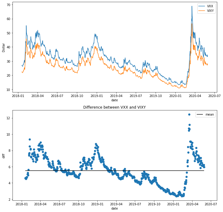
import matplotlib.pyplot as plt

# generate data
x = df["date"]
y = df["diff"]

fig = plt.figure(figsize=(12, 12))

ax1 = fig.add_subplot(2, 1, 2)
ax2 = fig.add_subplot(2, 1, 1)

ax1.scatter(x,y)

ax1.set_title('Difference between VXX and VIXY')
ax1.set_xlabel('date')
ax1.set_ylabel('diff')

ax1.legend()

ax1.hlines(y=df['diff'].mean(),xmin=df["date"].min(),xmax=df["date"].max(), label='mean') #横軸

ax2.plot(x, df["close"], label='VXX')
ax2.plot(x, df["VIXY"], label='VIXY')

ax2.legend()
ax2.set_xlabel("date")
ax2.set_ylabel("Dollar")

fig.show()
2つの画面を追加する
ax1 = fig.add_subplot(2, 1, 2)
ax2 = fig.add_subplot(2, 1, 1)
ax1 = fig.add_subplot(2, 1, 2)
- 縦に2個、横に1個、2番目の画面を設定。
ax2 = fig.add_subplot(2, 1, 2)
- 縦に2個、横に1個、1番目の画面を設定。
ax1とax2のそれぞれに、グラフやチャートを1画面の時と同じように設定するだけです。
*1番目と2番めが逆になっていますが、仕様とは関係ありません。
逆にした意図は作成している途中で画面の上下を逆にしたかったからです。
コメント