mplfinanceはとても手軽にローソク足のチャートが作成できるので普段はそれで問題ないのですが、bokehは、年間などで部分的に値動きやインジゲーターなどの状態を確認したい時などに、チャートを拡大縮小やドラッグと便利です。
bokehはmplfinanceよりチャートの種類が豊富で、以下のページにサンプルがあります。

Gallery
All of the examples below are located in the examples subdirectory of the Bokeh repository. Click on an image below to see its code and interact with a live plo...
今回はローソク足のチャートの作成方法を紹介します。
はじめに
インストール
bokehは標準パッケージではありません。インストールが必要です。
pip install bokeh
インポート
インポートは公式サイトに従って、別名にしています。
from bokeh.plotting import figure, output_file, show
from bokeh.sampledata.stocks import MSFT
from math import pi
from bokeh.plotting import figure, output_file, show
from bokeh.sampledata.stocks import MSFT
from math import pi
from bokeh.plotting import figure, output_file, show
from bokeh.sampledata.stocks import MSFT
データについて
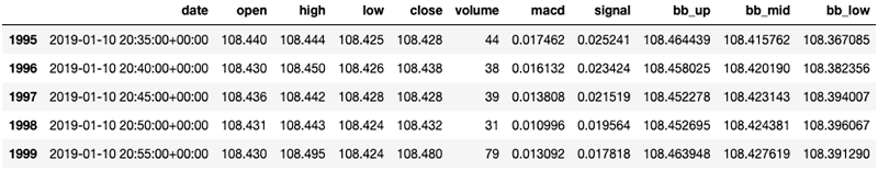
以下のような配列のデータを用意しています。画像は5分足ですが日足も用意しました。
dateカラムはpd.to_datetimeで変換していますが、インデックスではありません。注意してください。

基本
用意した日足データを50件ほど切り取って試しました。以下の感じですね。
df = df_master[50:100]
日足かつ50件のローソク足であれば、参考サイトの通りで表示できます。
w = 12*60*60*1000 # half day in ms
TOOLS = "pan,wheel_zoom,box_zoom,reset,save"
p = figure(x_axis_type="datetime", tools=TOOLS, plot_width=1000, title = "USD/JPY Candlestick Daily bar")
p.xaxis.major_label_orientation = pi/4
p.grid.grid_line_alpha=0.3
p.segment(df.date, df.high, df.date, df.low, color="black")
p.vbar(df.date[inc], w, df.open[inc], df.close[inc], fill_color="#D5E1DD", line_color="black")
p.vbar(df.date[dec], w, df.open[dec], df.close[dec], fill_color="#F2583E", line_color="black")
output_file("candlestick.html", title="candlestick.py example")
inc = df.close > df.open
dec = df.open > df.close
w = 12*60*60*1000 # half day in ms
TOOLS = "pan,wheel_zoom,box_zoom,reset,save"
p = figure(x_axis_type="datetime", tools=TOOLS, plot_width=1000, title = "USD/JPY Candlestick Daily bar")
p.xaxis.major_label_orientation = pi/4
p.grid.grid_line_alpha=0.3
p.segment(df.date, df.high, df.date, df.low, color="black")
p.vbar(df.date[inc], w, df.open[inc], df.close[inc], fill_color="#D5E1DD", line_color="black")
p.vbar(df.date[dec], w, df.open[dec], df.close[dec], fill_color="#F2583E", line_color="black")
output_file("candlestick.html", title="candlestick.py example")
show(p) # open a browser

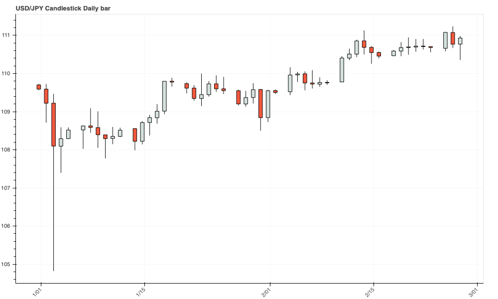
HTML版:bokeh_candlestick_example_Daily_bar
しかし、よく見ていただくとわかるのですが、問題があります。
- 休日が歯抜けになる。1分足とかだとさらに酷いことになります。
- 50件以上だとデザインが崩れる。
それらを改修して汎用性を持たせました。
以下を参考にしました。
![]()
bokeh-candlestick/candlestick_plot.py at master · ndepaola/bokeh-candlestick
Simple and responsive candlestick chart in Python with Bokeh - ndepaola/bokeh-candlestick
改修バージョン
bokehはローソク足を作るライブラリではないので、汎用性があり、対応次第って感じです。
悪くいうと無理やり作っている感があります。
改修内容や機能についての説明はソースの中に記載しました。
from bokeh.plotting import figure, output_file, show
TOOLS = "pan,wheel_zoom,box_zoom,reset,save"
# 日時表示用のフォーマットを設定(日足と分足に分岐
xaxis_dt_format = '%d %b %Y'
if df.iloc[0]['date'].second > 0:
xaxis_dt_format = '%d %b %Y %H:%M:%S'
x_axis_type="linear", # datetimeでは歯抜けになる。
plot_width=1000, # チャートの幅
title = "USD/JPY Candlestick Daily bar" # タイトルは任意に
p.xaxis.major_label_orientation = pi/4 # 日付を斜めに表示
p.grid.grid_line_alpha=0.3 # グリッドを薄く
# 以下のX軸を日付ではなくindexを設定するように変更
p.segment(df.index, df.high, df.index, df.low, color="black") # 高値と安値のラインを作成
p.vbar(df.index[inc], w, df.open[inc], df.close[inc], fill_color="#D5E1DD", line_color="black") # 陽線を作成
p.vbar(df.index[dec], w, df.open[dec], df.close[dec], fill_color="#F2583E", line_color="black") # 陰線を作成
p.xaxis.major_label_overrides = {
# i + 50: date.strftime(xaxis_dt_format) for i, date in enumerate(df["date"])
i: date.strftime(xaxis_dt_format) for i, date in enumerate(df["date"])
output_file("candlestick.html", title="candlestick.py example")
from bokeh.plotting import figure, output_file, show
# データフレームのマスクを設定
inc = df.close > df.open
dec = ~inc
# ローソク足の幅は固定
w = 0.5
TOOLS = "pan,wheel_zoom,box_zoom,reset,save"
# 日時表示用のフォーマットを設定(日足と分足に分岐
xaxis_dt_format = '%d %b %Y'
if df.iloc[0]['date'].second > 0:
xaxis_dt_format = '%d %b %Y %H:%M:%S'
# チャートの設定
p = figure(
x_axis_type="linear", # datetimeでは歯抜けになる。
tools=TOOLS,
plot_width=1000, # チャートの幅
title = "USD/JPY Candlestick Daily bar" # タイトルは任意に
)
p.xaxis.major_label_orientation = pi/4 # 日付を斜めに表示
p.grid.grid_line_alpha=0.3 # グリッドを薄く
# 以下のX軸を日付ではなくindexを設定するように変更
p.segment(df.index, df.high, df.index, df.low, color="black") # 高値と安値のラインを作成
p.vbar(df.index[inc], w, df.open[inc], df.close[inc], fill_color="#D5E1DD", line_color="black") # 陽線を作成
p.vbar(df.index[dec], w, df.open[dec], df.close[dec], fill_color="#F2583E", line_color="black") # 陰線を作成
# indexでラベルしたものを日付に上書き
p.xaxis.major_label_overrides = {
# i + 50: date.strftime(xaxis_dt_format) for i, date in enumerate(df["date"])
i: date.strftime(xaxis_dt_format) for i, date in enumerate(df["date"])
}
output_file("candlestick.html", title="candlestick.py example")
show(p) # open a browser

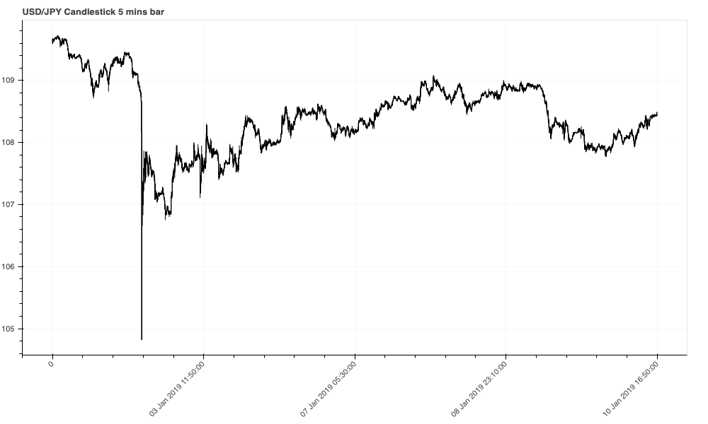
HTML版:bokeh_candlestick_example_5_mins_bar
応用(チャートのカスタマイズ)
やっと応用に入れます。ここからは簡単でした。
各種ツール(tools)
bokehはチャートを拡大縮小やドラッグなどの機能をtoolsに設定します。
主な機能は以下の通り。
- pan:水平・垂直移動
- wheel_zoom:マウスのホイールによる拡大縮小
- box_zoom:マウスのドラッグによる拡大縮小
- box_select:マウスのドラッグでチャートを選択
- crosshair:マウスの位置を十字の罫線で示す
- reset:チャートを初期状態に戻す
- save:チャートを画像で保存する
その他の機能は以下の公式サイトを参照してください。
![]()
https://docs.bokeh.org/en/latest/docs/user_guide/tools.html
色の指定
16進数での指定も可能ですが、以下の色名で指定することが可能です。
公式サイトにカラーチャートがありましたので、そこで色を見つけることができます。
![]()
bokeh.colors
Provide classes for representing RGB(A) and HSL(A) colors, as well as define common named colors. bokeh.colors.Color: Provide a base class for representing colo...
色のセットをパレットで指定することもできます。
その場合、予めインポートが必要になります。
from bokeh.palettes import Spectral
palette=Spectral[6]
パレットの種類も公式サイトにカラーチャートがあります。
例えば、上記のパレットのSpectralは、公式サイトに3〜11のセットがありますので配列として指定します。
![]()
bokeh.palettes
Provide a collection of palettes for color mapping. In the context of Bokeh, a palette is a simple plain Python list of (hex) RGB color strings. For example the...
凡例の位置
グラフ内で位置を指定する
p.legend.location = "top_left"
以下を指定できます。
- top_right
- top_left
- bottom_left
- bottom_right
グラフの外に描画する
p.add_layout(p.legend[0], "left")
以下を指定できます。
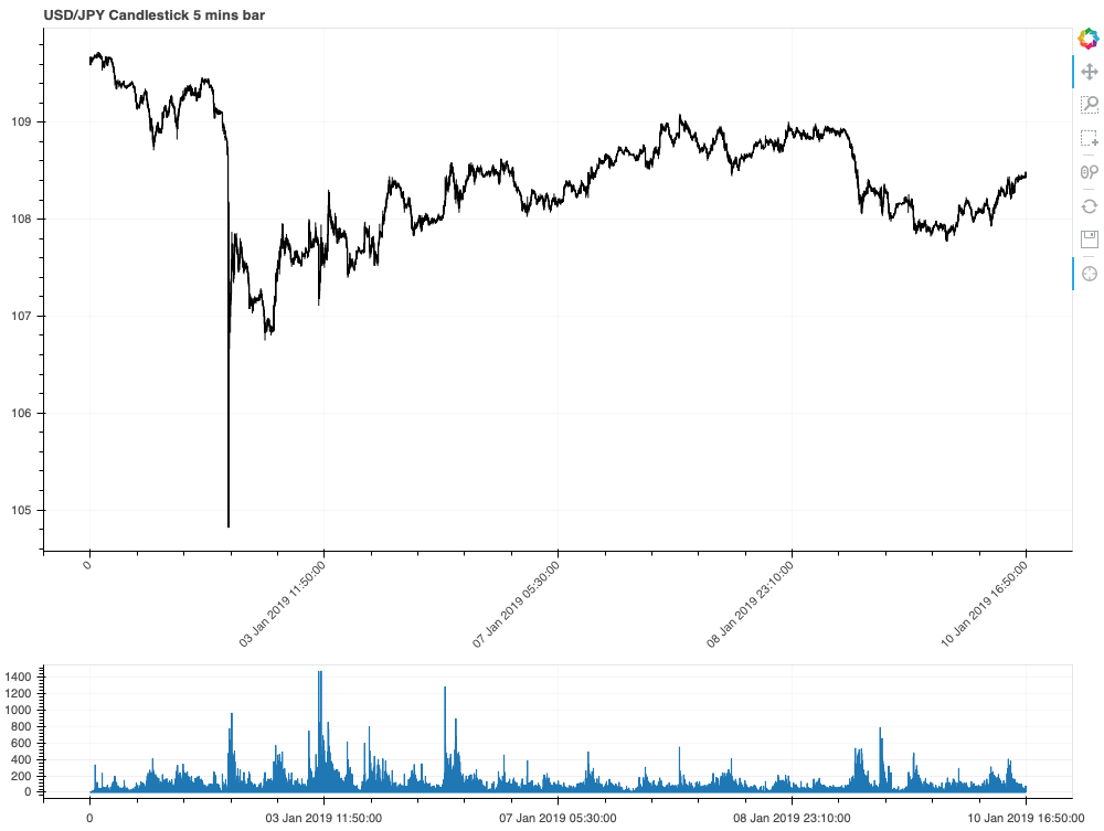
2画面にして下の画面に棒グラフの出来高を追加
2画面にする場合は、bokeh.layouts
をインポートしておく必要があります。
from bokeh.layouts import column
以下が2画面、棒グラフの表示です。
解説
- 前半部分は基本的に変わりません。(
bokeh.layouts
のインポートは忘れずに - p1にfigureで2画面目のチャートを初期設定します。設定は基本的に1画面目と同じです。
*今回は出来高(volume)データを表示させようとしましたが全て-1だったのbb_widthのカラムの値としています。- 2画面目もtoolsを指定できますが、今回は非表示としました。非表示にする場合は
toolbar_location=None
と設定します。 - toolbar_location=”below”とすると横向きになります。

- グリッドやXラベルの設定も同じです。今回は画面の都合上、Xラベルを斜めにしていません。
p1.x_range = p.x_range
がとても重要です。これを設定しておくと上下の2画面のX軸を連動させることができます。(これにハマりました。。。p1.vbar
で棒グラフを表示します。ローソク足と同じですが、むしろローソク足の方が棒グラフの応用という感じです。- ラベルの上書きを2画面目も行います。
- 最後に、
show(column(p,p1))
でcolumn
で2画面をパックにして出力します。
TOOLS = "pan,wheel_zoom,box_zoom,box_select,crosshair,reset,save"
# 日時表示用のフォーマットを設定(日足と分足に分岐
xaxis_dt_format = '%d %b %Y'
if df.iloc[0]['date'].hour > 0:
xaxis_dt_format = '%d %b %Y %H:%M:%S'
x_axis_type="linear", # datetimeでは歯抜けになる。
plot_width=1000, # チャートの幅
title = "USD/JPY Candlestick 5 mins bar" # タイトルは任意に
p.xaxis.major_label_orientation = pi/4 # 日付を斜めに表示
p.grid.grid_line_alpha=0.3 # グリッドを薄く
# 以下のX軸を日付ではなくindexを設定するように変更
p.segment(df.index, df.high, df.index, df.low, color="black") # 高値と安値のラインを作成
p.vbar(df.index[inc], w, df.open[inc], df.close[inc], fill_color="#D5E1DD", line_color="black") # 陽線を作成
p.vbar(df.index[dec], w, df.open[dec], df.close[dec], fill_color="#F2583E", line_color="black") # 陰線を作成
# -------------------------------
# p1.xaxis.major_label_orientation = pi/4 # 日付を斜めに表示
p1.grid.grid_line_alpha=0.3 # グリッドを薄く
p1.vbar(df.index, w, df.bb_width)
# -------------------------------
p.xaxis.major_label_overrides = {
i + 50: date.strftime(xaxis_dt_format) for i, date in enumerate(df["date"])
p1.xaxis.major_label_overrides = {
i + 50: date.strftime(xaxis_dt_format) for i, date in enumerate(df["date"])
output_file("candlestick.html", title="candlestick.py example")
# データフレームのマスクを設定
inc = df.close > df.open
dec = ~inc
# ローソク足の幅は固定
w = 0.5
TOOLS = "pan,wheel_zoom,box_zoom,box_select,crosshair,reset,save"
# 日時表示用のフォーマットを設定(日足と分足に分岐
xaxis_dt_format = '%d %b %Y'
if df.iloc[0]['date'].hour > 0:
xaxis_dt_format = '%d %b %Y %H:%M:%S'
# チャートの設定
p = figure(
x_axis_type="linear", # datetimeでは歯抜けになる。
tools=TOOLS,
plot_width=1000, # チャートの幅
title = "USD/JPY Candlestick 5 mins bar" # タイトルは任意に
)
p.xaxis.major_label_orientation = pi/4 # 日付を斜めに表示
p.grid.grid_line_alpha=0.3 # グリッドを薄く
# 以下のX軸を日付ではなくindexを設定するように変更
p.segment(df.index, df.high, df.index, df.low, color="black") # 高値と安値のラインを作成
p.vbar(df.index[inc], w, df.open[inc], df.close[inc], fill_color="#D5E1DD", line_color="black") # 陽線を作成
p.vbar(df.index[dec], w, df.open[dec], df.close[dec], fill_color="#F2583E", line_color="black") # 陰線を作成
# -------------------------------
# 出来高(bb_width
p1 = figure(
x_axis_type="linear",
# tools=TOOLS,
toolbar_location=None,
plot_width=1000,
plot_height=150,
title = ""
)
# p1.xaxis.major_label_orientation = pi/4 # 日付を斜めに表示
p1.grid.grid_line_alpha=0.3 # グリッドを薄く
p1.x_range = p.x_range
p1.vbar(df.index, w, df.bb_width)
# -------------------------------
# indexでラベルしたものを日付に上書き
p.xaxis.major_label_overrides = {
i + 50: date.strftime(xaxis_dt_format) for i, date in enumerate(df["date"])
}
p1.xaxis.major_label_overrides = {
i + 50: date.strftime(xaxis_dt_format) for i, date in enumerate(df["date"])
}
output_file("candlestick.html", title="candlestick.py example")
show(column(p,p1))

HTML版:bokeh_candlestick_example_two_windows
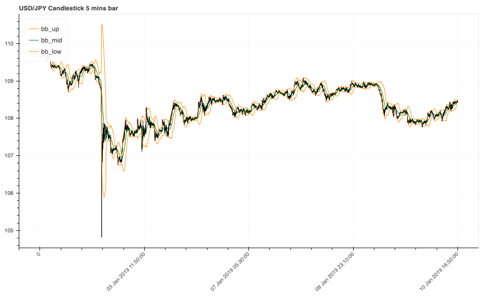
上のチャートに別のグラフを追加(ボリンジャーバンド
以下の3行を足すだけです。
p.line(df.index,df.bb_up, color = 'darkorange', legend = 'bb_up')
p.line(df.index,df.bb_mid, color = 'green', legend = 'bb_mid')
p.line(df.index,df.bb_low, color = 'darkorange', legend = 'bb_low')
p.line(df.index,df.bb_up, color = 'darkorange', legend = 'bb_up')
p.line(df.index,df.bb_mid, color = 'green', legend = 'bb_mid')
p.line(df.index,df.bb_low, color = 'darkorange', legend = 'bb_low')
p.line(df.index,df.bb_up, color = 'darkorange', legend = 'bb_up')
p.line(df.index,df.bb_mid, color = 'green', legend = 'bb_mid')
p.line(df.index,df.bb_low, color = 'darkorange', legend = 'bb_low')
*画像とサンプルHTMLは最後にまとめます。
下のチャートに別のグラフを追加(macd
追加するレンジが出来高と異なります。
そのため、まず以下のモジュールをインポートします。
from bokeh.models import LinearAxis, Range1d
追加するグラフのレンジを設定します。
p1.extra_y_ranges = {"macd": Range1d(start=df.macd.min(), end=df.macd.max())}
p1.add_layout(LinearAxis(y_range_name="macd"), 'right')
# 追加するグラフの名称とレンジを設定
p1.extra_y_ranges = {"macd": Range1d(start=df.macd.min(), end=df.macd.max())}
# 設定したレンジを右側に追加
p1.add_layout(LinearAxis(y_range_name="macd"), 'right')
# 追加するグラフの名称とレンジを設定
p1.extra_y_ranges = {"macd": Range1d(start=df.macd.min(), end=df.macd.max())}
# 設定したレンジを右側に追加
p1.add_layout(LinearAxis(y_range_name="macd"), 'right')
追加するグラフを設定します。
ポイントは先程設定したレンジ名をy_range_name="macd"
と指定していることです。その他は変わりありません。
p1.line(df.index, df.macd ,color = 'green', legend = 'macd', y_range_name="macd")
p1.line(df.index, df.signal ,color = 'yellow', legend = 'signal', y_range_name="macd")
p1.line(df.index, df.macd ,color = 'green', legend = 'macd', y_range_name="macd")
p1.line(df.index, df.signal ,color = 'yellow', legend = 'signal', y_range_name="macd")
p1.line(df.index, df.macd ,color = 'green', legend = 'macd', y_range_name="macd")
p1.line(df.index, df.signal ,color = 'yellow', legend = 'signal', y_range_name="macd")
*画像とサンプルHTMLは最後にまとめます。
応用のまとめ
from bokeh.plotting import figure, output_file, show
from bokeh.layouts import column
from bokeh.models import LinearAxis, Range1d
TOOLS = "pan,wheel_zoom,box_zoom,box_select,crosshair,reset,save"
# 日時表示用のフォーマットを設定(日足と分足に分岐
xaxis_dt_format = '%d %b %Y'
if df.iloc[0]['date'].hour > 0:
xaxis_dt_format = '%d %b %Y %H:%M:%S'
# ------------------------------------------
x_axis_type="linear", # datetimeでは歯抜けになる。
plot_width=1000, # チャートの幅
title = "USD/JPY Candlestick 5 mins bar" # タイトルは任意に
p.xaxis.major_label_orientation = pi/4 # 日付を斜めに表示
p.grid.grid_line_alpha=0.3 # グリッドを薄く
p.segment(df.index, df.high, df.index, df.low, color="black") # 高値と安値のラインを作成
p.vbar(df.index[inc], w, df.open[inc], df.close[inc], fill_color="#D5E1DD", line_color="black") # 陽線を作成
p.vbar(df.index[dec], w, df.open[dec], df.close[dec], fill_color="#F2583E", line_color="black") # 陰線を作成
p.line(df.index,df.bb_up, color = 'darkorange', legend = 'bb_up')
p.line(df.index,df.bb_mid, color = 'green', legend = 'bb_mid')
p.line(df.index,df.bb_low, color = 'darkorange', legend = 'bb_low')
# ------------------------------------------
p1.extra_y_ranges = {"macd": Range1d(start=df.macd.min(), end=df.macd.max())}
p1.add_layout(LinearAxis(y_range_name="macd"), 'right')
# p1.xaxis.major_label_orientation = pi/4 # 日付を斜めに表示
p1.grid.grid_line_alpha=0.3 # グリッドを薄く
p1.vbar(df.index, w, df.volume)
p1.line(df.index, df.macd ,color = 'green', legend = 'macd', y_range_name="macd")
p1.line(df.index, df.signal ,color = 'yellow', legend = 'signal', y_range_name="macd")
# ------------------------------------------
p.xaxis.major_label_overrides = {
i + 50: date.strftime(xaxis_dt_format) for i, date in enumerate(df["date"])
p1.xaxis.major_label_overrides = {
i + 50: date.strftime(xaxis_dt_format) for i, date in enumerate(df["date"])
p.legend.location = 'top_left'
p1.legend.location = 'top_left'
# ------------------------------------------
output_file("candlestick.html", title="candlestick.py example")
from bokeh.plotting import figure, output_file, show
from bokeh.layouts import column
from bokeh.models import LinearAxis, Range1d
# データフレームのマスクを設定
inc = df.close > df.open
dec = ~inc
# ローソク足の幅は固定
w = 0.5
TOOLS = "pan,wheel_zoom,box_zoom,box_select,crosshair,reset,save"
# 日時表示用のフォーマットを設定(日足と分足に分岐
xaxis_dt_format = '%d %b %Y'
if df.iloc[0]['date'].hour > 0:
xaxis_dt_format = '%d %b %Y %H:%M:%S'
# ------------------------------------------
# 1画面目(上の画面)
# 画面の初期設定
p = figure(
x_axis_type="linear", # datetimeでは歯抜けになる。
tools=TOOLS,
plot_width=1000, # チャートの幅
title = "USD/JPY Candlestick 5 mins bar" # タイトルは任意に
)
p.xaxis.major_label_orientation = pi/4 # 日付を斜めに表示
p.grid.grid_line_alpha=0.3 # グリッドを薄く
# ローソク足の設定
p.segment(df.index, df.high, df.index, df.low, color="black") # 高値と安値のラインを作成
p.vbar(df.index[inc], w, df.open[inc], df.close[inc], fill_color="#D5E1DD", line_color="black") # 陽線を作成
p.vbar(df.index[dec], w, df.open[dec], df.close[dec], fill_color="#F2583E", line_color="black") # 陰線を作成
# 追加するチャートの設定
p.line(df.index,df.bb_up, color = 'darkorange', legend = 'bb_up')
p.line(df.index,df.bb_mid, color = 'green', legend = 'bb_mid')
p.line(df.index,df.bb_low, color = 'darkorange', legend = 'bb_low')
# ------------------------------------------
# 2画面目(下の画面)
# 画面の初期設定
p1 = figure(
x_axis_type="linear",
# tools=TOOLS,
toolbar_location=None,
plot_width=1000,
plot_height=150,
title = ""
)
# 追加するグラフの名称とレンジを設定
p1.extra_y_ranges = {"macd": Range1d(start=df.macd.min(), end=df.macd.max())}
# 設定したレンジを右側に追加
p1.add_layout(LinearAxis(y_range_name="macd"), 'right')
# p1.xaxis.major_label_orientation = pi/4 # 日付を斜めに表示
p1.grid.grid_line_alpha=0.3 # グリッドを薄く
# 上下の画面のX軸を連動
p1.x_range = p.x_range
# 棒グラフの設定(出来高
p1.vbar(df.index, w, df.volume)
# 追加するチャートの設定(macd
p1.line(df.index, df.macd ,color = 'green', legend = 'macd', y_range_name="macd")
p1.line(df.index, df.signal ,color = 'yellow', legend = 'signal', y_range_name="macd")
# ------------------------------------------
# indexでラベルしたものを日付に上書き
p.xaxis.major_label_overrides = {
i + 50: date.strftime(xaxis_dt_format) for i, date in enumerate(df["date"])
}
p1.xaxis.major_label_overrides = {
i + 50: date.strftime(xaxis_dt_format) for i, date in enumerate(df["date"])
}
# ラベルの位置を設定
p.legend.location = 'top_left'
p1.legend.location = 'top_left'
# ------------------------------------------
# 出力
output_file("candlestick.html", title="candlestick.py example")
show(column(p,p1))

HTML版:bokeh_candlestick_example
補足
チャートのライン間を塗りつぶし
以下のようにfigureに追加すれば塗りつぶすことができます。バンド系のチャートで利用することがありますね。
p.varea(x=df.index, y1=ラインの値1, y2=ラインの値2, color=色, alpha=濃さ)
以下は、一目均衡表(Ichimoku Cloud)と先行スパン1と先行スパン2の間を塗りつぶしの例です。
x_axis_type="linear", # datetimeでは歯抜けになる。
plot_width=1000, # チャートの幅
title = "USD/JPY Candlestick 1 DAY bar" # タイトルは任意に
p.segment(df.index, df.High, df.index, df.Low, color="black") # 高値と安値のラインを作成
p.vbar(df.index[inc], w, df.Open[inc], df.Close[inc], fill_color="crimson", line_color="black") # 陽線を作成
p.vbar(df.index[dec], w, df.Open[dec], df.Close[dec], fill_color="royalblue", line_color="black") # 陰線を作成
p.line(df.index,df.tenkansen, color = 'green', legend = 'tenkansen')
p.line(df.index,df.kijunsen, color = 'darkred', legend = 'kijunsen')
p.line(df.index,df.chiku_span, color = 'blue', legend = 'chiku_span')
p.line(df.index,df.senkou_a, color = 'purple', legend = 'senkou_a')
p.line(df.index,df.senkou_b, color = 'lightgreen', legend = 'senkou_b')
p.varea(x=df.index, y1=df.senkou_a, y2=df.senkou_b, color = 'blue', alpha=0.1)
# 画面の初期設定
p = figure(
x_axis_type="linear", # datetimeでは歯抜けになる。
tools=TOOLS,
plot_width=1000, # チャートの幅
title = "USD/JPY Candlestick 1 DAY bar" # タイトルは任意に
)
# ローソク足の設定
p.segment(df.index, df.High, df.index, df.Low, color="black") # 高値と安値のラインを作成
p.vbar(df.index[inc], w, df.Open[inc], df.Close[inc], fill_color="crimson", line_color="black") # 陽線を作成
p.vbar(df.index[dec], w, df.Open[dec], df.Close[dec], fill_color="royalblue", line_color="black") # 陰線を作成
# 追加するチャートの設定
p.line(df.index,df.tenkansen, color = 'green', legend = 'tenkansen')
p.line(df.index,df.kijunsen, color = 'darkred', legend = 'kijunsen')
p.line(df.index,df.chiku_span, color = 'blue', legend = 'chiku_span')
p.line(df.index,df.senkou_a, color = 'purple', legend = 'senkou_a')
p.line(df.index,df.senkou_b, color = 'lightgreen', legend = 'senkou_b')
p.varea(x=df.index, y1=df.senkou_a, y2=df.senkou_b, color = 'blue', alpha=0.1)
操作方法
基本的には触ってもらえればわかると思うのですが、1点だけ気付きにくいところがあるので説明します。
縦と横の目盛の幅(レンジ)もマウスのホイールで拡大・縮小ができます。
をクリックした後、目盛のラベルの上にマウスを持っていきホイールするだけです。
コメント