
はじめに
Pythonのライブラリのbokehでグラフやチャートを手軽に作成することができます。
以下は公式サイトです。

Bokeh documentation
Bokeh is a Python library for creating interactive visualizations for modern web browsers. It helps you build beautiful graphics, ranging from simple plots to c...
docs.bokeh.org
ツールチップのページは以下になります。
tools
Bokeh comes with a number of interactive tools. There are five types of tool interactions: Pan/Drag. Click/Tap. Scroll/Pinch. Actions. Inspectors. For the first...
docs.bokeh.org

https://docs.bokeh.org/en/latest/docs/user_guide/tools.html#basic-tooltips
docs.bokeh.org
bokehを使ったチャートの作成は、本サイトの以下を参照してください。
Pythonのbokehで拡大縮小やドラッグができるローソク足のチャートを作る
ツールチップ(TOOLTIPS)を表示
以下のデータ(df)がある前提です。
        date    dow30    sp500  nasdaq100     n225  USD_JPY
0 2010-05-20  10056.0  1070.00    1800.50  10040.0    89.87
1 2010-05-21  10160.0  1084.50    1819.25   9730.0    89.99
2 2010-05-24  10043.0  1071.00    1812.50   9760.0    90.11
3 2010-05-25  10025.0  1073.00    1815.50   9440.0    90.33
4 2010-05-26   9921.0  1061.25    1791.50   9490.0    89.98
・・・
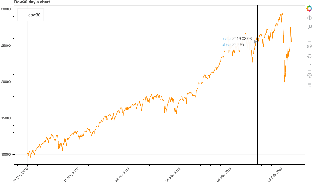
HTMLはこちら:bokeh_tooltips_1
from math import pi
from bokeh.plotting import figure, output_file, show, ColumnDataSource
from bokeh.models import HoverTool

df['date2'] = df['date'].astype(str)

chart_title = "Dow30 day's chart"

TOOLS = "pan,wheel_zoom,box_zoom,box_select,crosshair,reset,save"

TOOLTIPS=[
    ( 'date',   '@date' ),
    ( 'close',  '@close{0,0}' ), # use @{ } for field names with spaces
]

# 日時表示用のフォーマットを設定(日足と分足に分岐
xaxis_dt_format = '%d %b %Y'
if df.iloc[0]['date'].second > 0:
    xaxis_dt_format = '%d %b %Y %H:%M:%S'

source = ColumnDataSource(data=dict(
    index = df.index,
    date = df.date2,
    close = df.dow30,
))

# チャートの設定
p = figure(
    x_axis_type="linear", # datetimeでは歯抜けになる。
    tools=TOOLS,
    plot_width=1000, # チャートの幅
    tooltips=TOOLTIPS,
    title = chart_title # タイトルは任意に
)

p.xaxis.major_label_orientation = pi/4 # 日付を斜めに表示
p.grid.grid_line_alpha=0.3 # グリッドを薄く

p.line("index", "close", color = 'darkorange', legend_label = 'dow30', source=source)

# -------------------------------

# indexでラベルしたものを日付に上書き
p.xaxis.major_label_overrides = {
    i: date.strftime(xaxis_dt_format) for i, date in enumerate(df["date"])
}
p.legend.location = "top_left"

output_file("candlestick.html", title=chart_title)

show(p)
source = ColumnDataSource
- 別記事のチャート作成では利用していませんが、今回はこちらでbokehに渡すデータを作成しています。
- dateをindexとして渡していないのは、別記事のチャート作成で説明しているとおり、日時の場合は自動的に歯抜けの日を自動で補完してしまうからです。
TOOLTIPS
- 表示させたいツールチップを設定します。
- 値
$index:データの位置(インデックス)$x, $y:ポイントの座標(マウスの位置)@name:ColumnDataSourceで設定している値の名称
- 値のフォーマット
- カンマ区切り:{0,0}
- 小数点:{0.00} *この例は小数点第2位までです。
- パーセント:{%0.0} *この例は小数点第1位までです。
- 日時・日付:うまく動作しなかったので、予めdfでテキスト情報を保持して、それを表示させています。
df['date2'] = df['date'].astype(str) - その他は以下を参照してください。
Formatting Tooltip Fields
figure
tooltips=TOOLTIPS:ツールチップを設定します。
複数のグラフの値を表示
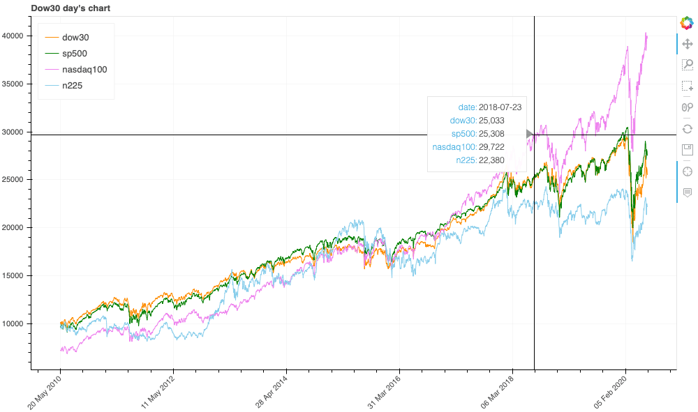
HTMLはこちら:bokeh_tooltips_2
from math import pi
from bokeh.plotting import figure, output_file, show, ColumnDataSource
from bokeh.models import HoverTool

chart_title = "Dow30 day's chart"

TOOLS = "pan,wheel_zoom,box_zoom,box_select,crosshair,reset,save"

TOOLTIPS=[
    ( 'date',   '@date' ),
    ( 'dow30',  '@dow30{0,0}' ), # use @{ } for field names with spaces
    ( 'sp500',  '@sp500{0,0}' ), # use @{ } for field names with spaces
    ( 'nasdaq100',  '@nasdaq100{0,0}' ), # use @{ } for field names with spaces
    ( 'n225',  '@n225{0,0}' ), # use @{ } for field names with spaces
]

# 日時表示用のフォーマットを設定(日足と分足に分岐
xaxis_dt_format = '%d %b %Y'
if df.iloc[0]['date'].second > 0:
    xaxis_dt_format = '%d %b %Y %H:%M:%S'

source = ColumnDataSource(data=dict(
    index = df.index,
    date = df.date2,
    dow30 = df.dow30,
    sp500 = df.sp500*9,
    nasdaq100 = df.nasdaq100*4,
    n225 = df.n225,
))

# チャートの設定
p = figure(
    x_axis_type="linear", # datetimeでは歯抜けになる。
    tools=TOOLS,
    plot_width=1000, # チャートの幅
    tooltips=TOOLTIPS,
    title = chart_title # タイトルは任意に
)

p.xaxis.major_label_orientation = pi/4 # 日付を斜めに表示
p.grid.grid_line_alpha=0.3 # グリッドを薄く

p.line("index", "dow30", color = 'darkorange', legend_label = 'dow30', source=source)
p.line("index", "sp500", color = 'green', legend_label = 'sp500', source=source)
p.line("index", "nasdaq100", color = 'violet', legend_label = 'nasdaq100', source=source)
p.line("index", "n225", color = 'skyblue', legend_label = 'n225', source=source)

# -------------------------------

# indexでラベルしたものを日付に上書き
p.xaxis.major_label_overrides = {
    i: date.strftime(xaxis_dt_format) for i, date in enumerate(df["date"])
}
p.legend.location = "top_left"

output_file("candlestick.html", title=chart_title)

show(p)
ツールチップのカスタマイズ
以下を参照してください。

https://docs.bokeh.org/en/latest/docs/user_guide/tools.html#custom-hover-tooltip
docs.bokeh.org
コメント